NEW TO VERSION 4.3
This tag allows you to create a tabbed user interface for your XMod form much like a Rolodex or set of manila folders. When a tab is clicked, it becomes the selected tab and its associated content is shown, while any previously visible tab content is hidden. The tabstrip relies on and requires that Javascript be enabled in your users' browsers. Using the <tabstrip> control you can quickly create an attractive interface to turn larger forms into paged forms, presenting data to the user in smaller, more manageable chunks.
|
backcolor |
The background color for the tab. |
|
bordercolor |
The color of the border which serves as an outline for each tab an its associated content. |
|
forecolor |
The color of the text in the tab. |
|
selectedbackcolor |
The background color of a tab and its associated content when it is selected |
|
selectedforecolor |
The color of the text of the tab when it is selected |
|
hoverbackcolor |
The background color of a tab when the mouse hovers over it |
|
hoverforecolor |
The color of the text in the tab when the mouse hovers over it |
|
fontsize |
The size of the text in the tab |
|
fontnames |
A comma-delimited list of font family names to be used for the text in the tab such as "Verdana, Arial, Helvetica, sans-serif" |
|
fontweight |
CSS value determining the "boldness" of the text in the tab. Valid values are: bold, bolder, inherit, lighter, normal, 100, 200, 300, 400, 500, 600, 700, 800, 900. Not all values may be recognized in all browsers. Typical values are bold and normal. |
|
showpanelborders |
A boolean value (true/false) which determines if there will be borders drawn around the content area of the tab. This value is true by default. |
|
width |
A unit determining the width of the tabstrip and the associated content area. |
|
height |
A unit determining the height of the tabstrip and associated content area. Note, the height component may not work on all browsers. |
|
tab |
Defines a single tab in the tabstrip. The tab tag also acts as a container for the content to be displayed when the tab is selected (see examples) |
|
text |
The caption text to be displayed in the tab. |
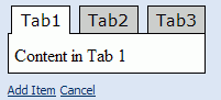
Here is a bare-bones version of the tabstrip. A more colorful and advanced version follows this example:
<form>
<controls>
<tabstrip>
<tab text="Tab1">Content in Tab 1</tab>
<tab text="Tab2">Content in Tab 2</tab>
<tab text="Tab3">Content in Tab 3</tab>
</tabstrip>
</content>
</form>
The result looks something like this:
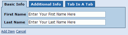
The example below is a custom HTML form that displays as a 3-tabbed form with a nice shades-of-blue color scheme. On the first tab are text boxes to enter basic information:
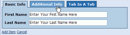
This next image shows the tab providing a visual cue to the user by changing its background color when the mouse hovers over it:
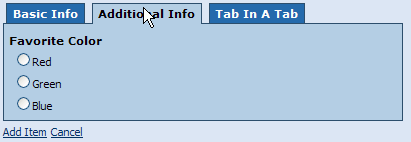
The Additional Info tab gathers the user's favorite color from a short list of primary colors.:
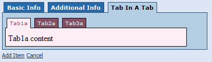
The third and final tab shows an example of a tabstrip within a tab. This also shows that the embedded tabstrip can use a different color scheme and fonts. :
And here's the code to reproduce the form:
<form format="custom">
<controls>
<tabstrip width="400px" bordercolor="#2E4D6B" backcolor="#2068AC" fontsize="11px" fontweight="bold" fontnames="Verdana, Tahoma, sans-serif" forecolor="#FFFFFF" hoverbackcolor="#669ACC" selectedbackcolor="#B3CDE6">
<tab text="Basic Info">
<literal><table border="0" cellpadding="3" cellspacing="0"><tr><td style="font-family: Verdana, Tahoma;font-size:11px;font-weight:bold;">First Name </td><td></literal>
<input ref="FirstName" class="NormalTextBox" width="250px" maxlength="50">
<label>First Name</label>
<default>Enter Your First Name Here</default>
</input><literal></td></tr><tr><td style="font-family: Verdana, Tahoma;font-size:11px;font-weight:bold;">Last Name</td><td></literal>
<input ref="LastName" class="NormalTextBox" width="250px" maxlength="50">
<label>Last Name</label>
<default>Enter Your Last Name Here</default>
</input><literal></td></tr></table></literal>
</tab>
<tab text="Additional Info"><literal><span style="font-family: Verdana, Tahoma;font-size:11px;font-weight:bold;">Favorite Color </span></literal>
<select1 ref="FavoriteColor" appearance="full" class="Normal">
<label>Favorite Color</label>
<items>
<item>
<label>Red</label>
<value>#FF0000</value>
</item>
<item>
<label>Green</label>
<value>#00FF00</value>
</item>
<item>
<label>Blue</label>
<value>#0000FF</value>
</item>
</items>
</select1>
</tab>
<tab text="Tab In A Tab">
<tabstrip width="90%" forecolor="#FFFFFF" backcolor="#804D67" selectedforecolor="#804D67" selectedbackcolor="#F8EDF2" hoverbackcolor="#E3B5CA" hoverforecolor="#FFFFFF" fontnames="Verdana, Tahoma" fontsize="10px">
<tab text="Tab1a">Tab1a content</tab>
<tab text="Tab2a">Tab2a content</tab>
<tab text="Tab3a">Tab3a content</tab>
</tabstrip>
</tab>
</tabstrip>
</controls>
</form>