 .
.Like all applications, the solution you create with XMod is going to need some way for you and your users to get data into the system. As with most applications, this is handled via a data-entry form. A form contains text an input controls such as text boxes, list boxes, and buttons that provide your users a mechanism for entering their data.
The data-entry form is the center of your application. It determines what data will be collected and specifies the names you'll give each field in the record. When you go to display your data, you'll be referring to the field names you create in your forms.
As of XMod 4, there are 3 types of forms you can create:
Auto-Layout Form. With this form type, you simply define what controls you want on your form and XMod handles all details for formatting and laying it out.
Custom HTML Form: This form type allows you to use your HTML skills to handle the formatting and layout of your form. It requires more knowledge and time, but gives you much greater control.
ASCX-Based Form: This form, new to version 4, is intended for those familiar with .NET programming. This form type requires the most time and knowledge but essentially gives you complete control over your form. For more information on this form type, see the sample project included in the XMod distribution package.
In this example, though, we'll be creating a simple Auto-Layout form.
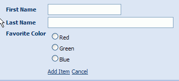
Let's take a look at a basic XMod form to see just how simple it can be to create. Along the way, we'll describe a number of features and provide explanations for a number of aspects and facets of XMod forms and form controls. The form we'll create will collect the First and Last Name of the user as well as their favorite color. At run-time, the form will look like this:
.
Behind-the-scenes, this form has been created by a form definition, which is a simple XML file that describes each control on the form. Before your eyes glaze over, the XML used by XMod is very basic and simple. You have tags that correspond to a type of control. For instance, the <input> tag will generate a text box. These tags also have properties (also called attributes) that customize the look and behavior of the control such as the width, whether the control is read-only, and much more.
The good news is that, as of XMod 4, you don't have to manually type out these form definitions for XMod's main controls. XMod 4 supplies control "designers" that allow you to fill out a form and XMod will generate the code for you. Even so, to get the most out of XMod, it helps to understand what a form definition is, and how XMod uses them to generate forms. At first glance, a form definition may seem complicated, but it is really pretty simple. Once you get past the format, you'll find that all you're doing is describing your form by using tags and those tags' properties to describe controls like text boxes, radio button lists, and more.
If you haven't done so already, add an XMod module instance to a page. Make sure you're logged-in as an Administrator or Host.
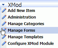
From the module's Actions Menu, select Manage Forms. This is where you add, edit, and delete your data-entry forms.
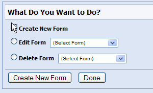
Next you'll see the main Manage Forms panel. Select the Create New Form option and click the Create New Form link.
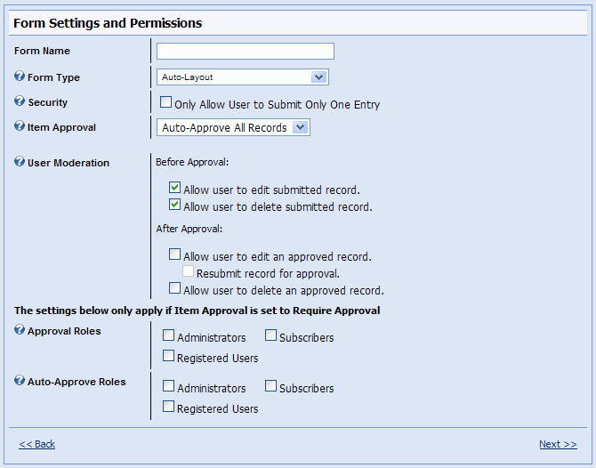
The next panel is the Form Settings and Permissions panel. Here, type Simple Form for form name. The panel should default to the correct values for the other items: Ensure Auto-Layout is selected for Form Type, make sure Only Allow One Record Per User is unchecked, and ensure that No Approval Needed is selected for Item Approval. Then click the Next>> link to go to the form editor.
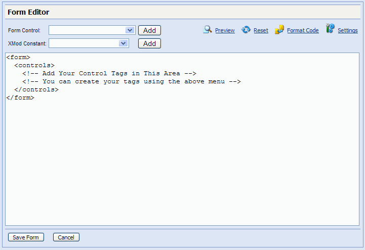
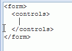
The Form Editor panel is where you'll do most of your work. For details on each part of the editor, refer to the Manage Forms help topic. Inside the editing area, you'll see a basic starter form. Between the <controls> and </controls> tags is where your control tags will go.
Delete the comments that appear between the <controls> and </controls> tags and place your cursor where you want the text box control to go. In this case, it's between the <controls> </controls> tags:
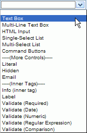
The first control we want to add is a text box for entering a First Name. From the Form Controls... drop-down list box, select Text Box:
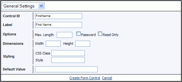
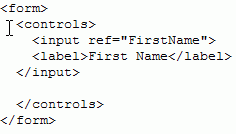
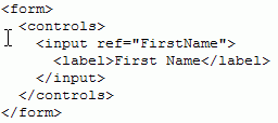

Click the Create Tag link, followed by the Format tool and your code should look like this. The new code is highlighted in red.:
<form>
<controls>
<input ref="FirstName">
<label>First Name</label>
</input>
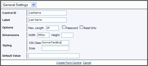
<input ref="LastName" width="250px" maxlength="25">
<label>Last Name</label>
</input>
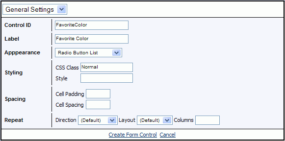
<select1 ref="FavoriteColor" class="Normal" appearance="full">
<label>Favorite Color</label>
<items>
<item>
<label>Red</label>
<value>#FF0000</value>
</item>
<item>
<label>Green</label>
<value>#00FF00</value>
</item>
<item>
<label>Blue</label>
<value>#0000FF</value>
</item>
</items>
</select1>
</controls>
</form>
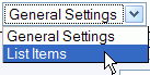
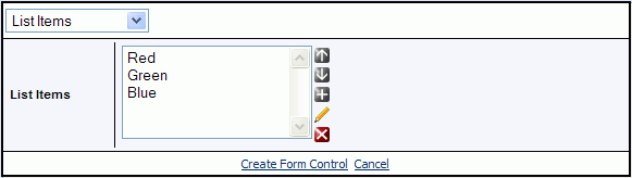
The designer has created a <select1> tag. It's called "select1" because the controls it generates allow the user to only select 1 item. By contrast, the tag that generates controls in which the user can select multiple items is simply the <select> tag. Although there's more code here, it's still pretty simple.
You'll notice our new tag has the ref property and the <label> tag, just like our text boxes. But what is that appearance="full" property? We selected "Radio Button List". Well, this is one area where the tag designer really helps. To generate a radio button list (which can take up a lot of screen space), the appearance property's value must be full. If we wanted a drop-down list, we would set it to minimal (because the drop-down list takes up the minimum amount of space). Finally, if we wanted a single-select list box, we would set it to compact - kind of a happy medium between the radio button list and the drop-down lists.
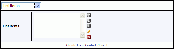
Inside the <select1> tag, you'll find our list of colors. We start the list with the <items> tag (notice items is plural) and signify the end of the list with the </items> closing tag. In between, we define as many items as we need for our list. Each item begins with the <item> tag and ends with the </item> closing tag.
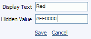
You'll remember that, for each color, we entered the color's name in the Display Text field and the RGB value in the Hidden Value field. That is reflected in the code by the <label> and <value> tags, respectively.
The form editor provides another helpful tool for working with your data-entry forms: The Form Preview. To get a good idea of how your form will look, click the Preview tool at the top of the editor. One word of caution, though. Many of the editor's functions are performed on your local machine. This is generally a good thing because it's much quicker than posting data back to the server over and over again. However, if you've spent a lot of time working with your form, your session may have timed-out on you. If so, DNN will prompt you to login again, and you may lose all your work. If this happens, you may be able to click the Back button on your browser to retrieve your work. To avoid losing your work during a long editing session, copy the contents of the editor before clicking the Preview button.

You should see a view similar to this - our simple form in all its glory. But wait, the First Name text box is a lot shorter than the Last Name text box. Let's tweak our form to make them the same size...:
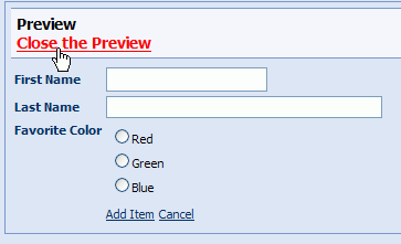
Click the Close the Preview link to return to the form editor.
Back in the Form Editor, find this code:
<input ref="FirstName">
<label>First Name</label>
</input>
And either edit it or replace it with the following code. All we're doing is setting the width of the First Name text box to the same as the Last Name text box. We're making the rest of the properties match as well.
<input ref="FirstName" width="250px" maxlength="25" class="NormalTextBox">
<label>First Name</label>
</input>
Click the Preview tool and view the results:
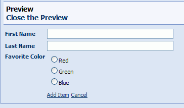
At this stage you can close the preview and click the Save Form link to save your changes. Congratulations! You've created your first XMod form.
Now that you've created a form, you should create some templates so you can display the information your form will collect. This is the subject of How Do I Create A Template. That tutorial uses the form we just made as its starting point and makes a great next step in learning more about XMod.
This exercise showed you how to create a form using the most popular XMod controls. These controls have tag designers to make it easy to use. However, there are many more tags available to you. Simply browse through Form Controls section of the help file for all the details. Each tag is described in detail, including its properties as well as examples for how to use them.