Managing XMod Templates
Templates constitute one the two components used in
creating solutions with XMod. Users enter data in your solution via data-entry
forms (see the Manage Forms topic).
Once that data has been stored, you need a way to display it to your end-users.
That's where templates come in. They describe how you want that data to
be presented to the user and usually include HTML (though it's not required)
to make the results more pleasing to the eye. Templates come in several
flavors (detail, list, and grid), but have one thing in common: they describe
how XMod should display a single record. When the template is a list or
grid, XMod will apply your template to all records in the list/grid (and
will create the HTML necessary to display that list or grid).
XMod 4 completely revamps the user interface for managing templates
used in previous versions. In this new iteration, we've tried to make
the process of creating display templates much simpler while still allowing
power users the freedom and flexibility they enjoyed in previous versions. XMod 5 expands on that interface by adding a new Rich Text editor for editing your templates.
Shortcuts:
Starting Panel
General Tab
Template Settings Tab
Item Settings Tab
Editor Tab
Starting Panel
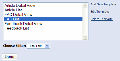
When you open the Manage Templates page, you'll see a list of all the templates
available for management. If no templates have yet been created, this
list will be blank. To the right of the list box you'll see the three
actions you can take:
- Add New Template:
Choose this option to create a new display template.
- Edit Template:
In the list box, select the template you'd like to edit, then click this
link.
- Delete Template:
In the list box, select the template you'd like to delete and click this
link. You'll be prompted to confirm the deletion. Please be aware that
this action is irreversible. Any XMod module instances that use the template
will no longer function correctly so you should remove or re-configure
them prior to deleting the template.
Below the list you'll see a drop-down list that allows you to choose which editor you want to use to edit the template. This is a new feature in XMod 5.0. You're choices are the Plain Text editor that came in earlier versions and the new Rich Text editor which gives you more of a a WYSIWYG view of your template.
Back to Top
General Tab
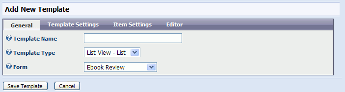
When creating or editing a template, you'll be presented with a view
similar to the one above. The primary difference is that the Template
Type is read-only when you're editing.
- Template Name:
Provide a descriptive name for your template here.
- Template Type:
There are three types of template you can choose from (listed below). When you choose a new template type, the form may post back to the server. Please give it an opportunity to do so before continuing.
- Detail View:
This type of template is intended to display a single record. A typical
scenario for this type of template is a news article solution in which
the user clicks on a headline (from a list of headlines) and views the
full story. The detail view template, in this scenario, would be the full
story. When this template type is selected, the Template
Settings and Item
Settings tabs will not be shown (as those options aren't
used in detail views).
- List View
- List: This template type is intended to display more than one
record. In the news story scenario described above, this template would
be the list of headlines. The typical use for this type of template is
to allow the user to browse a collection of records. It also allows the
user to search and sort the results.
- List View
- Grid: This template serves the same purpose as the List View
- List, but allows you to format the records as a series of rows and columns.
- List View - Repeater: New to XMod 5.0. Much as the custom HTML layout form type, the Repeater template type allows you complete control over the HTML that gets generated by XMod. Lists and Grids render as HTML tables. The Repeater, however, enables you to create unordered lists, ordered lists, single lines followed by a line break, and even tables. The Repeater template is meant for those who need the extra flexibility to generate standards compliant code or need to craft custom layouts using CSS. The combination of the Repeater with CSS opens up a vast new area of layout and styling possibilities.
- Form Fields:
You can associate this template with a data-entry form. While not required,
doing so allows the Template Editor pre-load the form's fields, saving
you a lot of keystrokes when creating/editing your template. Plus, your
choice will be saved so the form will be pre-selected for you the next
time you edit this template. Note that selecting a form may cause the page to post back to the server. Please give it an opportunity to do so before continuing.
Back to Top
Template Settings Tab
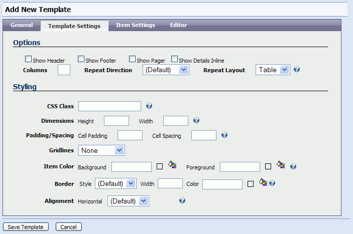
This tab is only visible for List and Grid templates. Depending on the
type of template you select, your options may differ somewhat.
- Show Header/Show
Footer: If checked, the template will display a header and/or footer
section. If this is a Grid, the header/footer refers to column headings
and column footers which are defined within your template. If this is
a List, the header/footer contents are defined when you configure the
XMod module instance (via the "Configure XMod Module" Action
menu).
- Show Pager:
If you want to display more than a single page of results to your users,
you'll want to check this box. It instructs XMod to display a page-navigation
bar to aid users in moving from page-to-page in your resultset. The pager's
look can be customized on the Item Settings
tab.
- Show Details
Inline: When the user clicks a link to see the details of an individual
record, if you want that detail view to display on the same page as the
list view (the detail view will temporarily replace the list view until
the user clicks the "Return" link on the detail view) then check
this box. Otherwise, the details will be displayed on a separate page.
- Columns/Repeat
Direction: These options only show if the template is a List (not
a Grid) template. They determine how each record should be laid out on
the page. If you enter a number of 2 or greater for Columns
then list will display as a series of columns with each record residing
in a single cell within the resulting table. The order in which the records
are displayed is governed by the Repeat
Direction option. Choosing "Vertical" will layout records
from top-to-bottom, then left-to-right. Choosing "Horizontal"
will repeat the records from left-to-right, then top-to-bottom. Leave
the Columns option blank to only
display a single column.
- CSS Class:
Name
of the CSS (Cascading Style Sheets) class used to style this template
display, as a whole.
- Dimensions:
Determines
the height and width of the display. Note that height is largely determined
by the contents and may not be recognized in all browsers. Leaving height
empty is the usual practice.
- Padding/Spacing:
These
settings determine the number of pixels between cells (Cell Spacing) as
well as the amount of space between the each cell's contents and its borders
(Cell Padding)
- Gridlines:
Determines if the resulting display will show Vertical lines, Horizontal
lines, Both, or None at all.
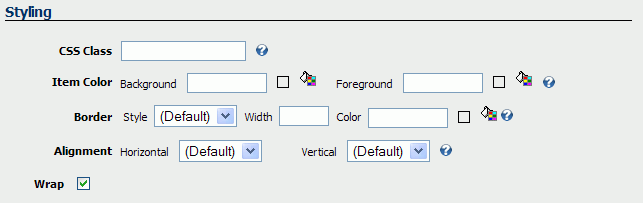
- Item Color:
The
colors to use for the display background and foreground. Valid color names
or RGB values can be used (ex: black or #00000). You can click the little
paint can icon to visually select a web-safe color.
- Border:
Border Width specifies
the width of the item's border (if it's style isn't set to 'None'). Values
may be in pixels (px), points (pt), centimeters (cm), millimeters (mm),
inches (in), or Ems (em). Examples: 3px or 12pt. Border Style
determines how the border line should be drawn. Not all values border
styles are recognized by all browsers. Border
Color
defines color of the display's border. Valid color names or RGB values
are valid here (ex: black or #000000). Again, you can use the color picker
to visually select a color by clicking the paint can icon.
- Alignment:
Determines
the Horizontal alignment of the display.
Back to Top
Item Settings Tab
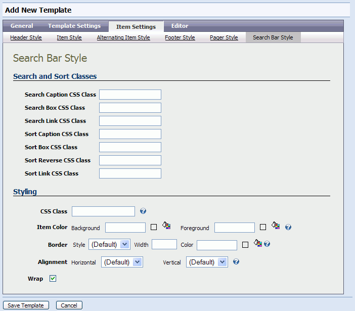
The Item Settings Tab is only available if you've chosen a List or Grid
template type. This tab allows you to adjust the properties for the different
components of the template: the Search Bar (which also contains sorting),
Header, Footer, Item (each row in the template), Alternating Item (every
other row in the template), and Pager (the page navigation control supplied
by XMod). You navigate to each component by clicking on the item in the
row of tabs directly below the main row of tabs.
Most of the components share a styling section that contains many of
the styling properties found on the Template Settings Tab:
- CSS Class:
Name of the CSS (Cascading Style Sheets) class used to
style the item (header, footer, item, etc).
- Item Color:
The colors to use for the display background and foreground.
Valid color names or RGB values can be used (ex: black or #00000). You
can click the little paint can icon to visually select a web-safe color.
- Border:
Border Width specifies
the width of the item's border (if it's style isn't set to 'None'). Values
may be in pixels (px), points (pt), centimeters (cm), millimeters (mm),
inches (in), or Ems (em). Examples: 3px or 12pt. Border Style determines
how the border line should be drawn. Not all values border styles are
recognized by all browsers. Border
Color defines color of the display's border. Valid
color names or RGB values are valid here (ex: black or #000000). Again,
you can use the color picker to visually select a color by clicking the
paint can icon.
- Alignment:
Determines the Horizontal and Vertical alignment of the
item.
- Wrap:
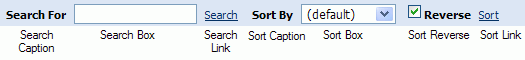
The Search Bar Style tab includes the following additional properties
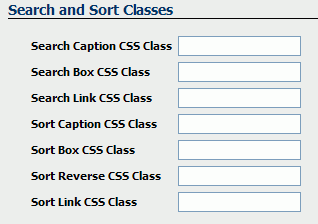
Each item defines the CSS Class to be applied to a specific part of
the Search Bar. Those parts are identified below:
The Pager Style tab includes the following additional properties:
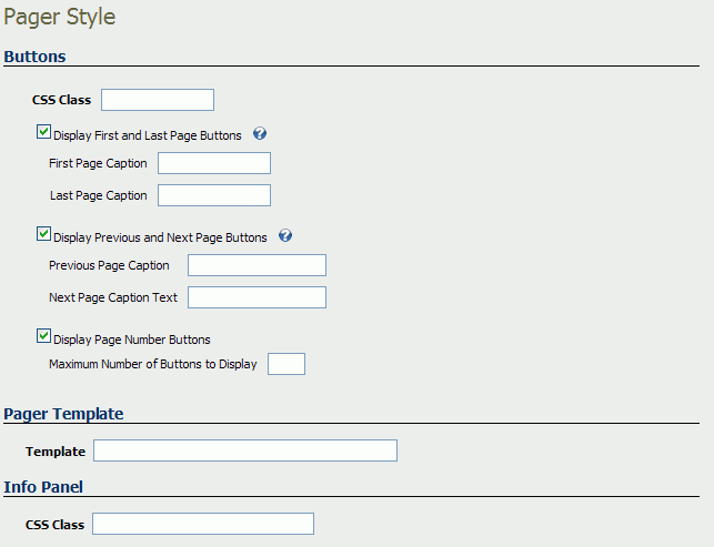
The Pager is shown below, with labels of each component.
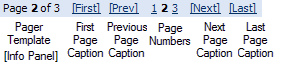
Buttons
- CSS Class:
Specifies the Cascading Style Sheets class name to use to style the page
information panel.
- Display First
and Last Page Buttons: When this box is checked, two text boxes
appear where you can specify the text to use for the First and Last page
buttons.
- Display Previous
and Next Page Buttons: When this box is checked, two text boxes
appear where you can specify the text to use for the Previous and Next
page buttons.
- Display Page
Number Buttons: When this box is checked, a text box appears where
you can specify the maximum number of page number buttons to display.
The page number buttons allow the user to navigate to a specific page
within a range of the current page number. For instance, if you put 5
in this box and the current page is 3 then XMod will display up to 5 page
number buttons:
1 2 3 4 5 6
If the
current page number is 4 then the following would be displayed: 2 3 4 5 6 7
If there
were only 6 total pages, though, the following would be displayed: 1 2 3 4 5 6
Pager Template
The pager template allows you to define how the paging information will
be formatted and displayed to the user. You can use HTML and two special
placeholders which allow you to position the paging information: {Page}
represents the current page and {PageCount} represents the total number
of pages.
Info Panel
- CSS Class:
Specifies the Cascading Style Sheets class name to use to style the page
information panel.
Back to Top
Editor Tab
The editor tab is where you actually define your template. Templates
are a mix of plain text, HTML, and special XMod tags. The XMod tags allow
you to position your data. They also package additional functionality
like Javascript-based collapsible panels.
XMod 5 comes with two types of editors for working with templates - The Plain Text Editor, which is historically what has come with XMod, and the Rich Text Editor - a new addition starting with 5.0 - which provides you with a more word-processor-like approach to creating templates. The editor you see on the Editor tab is determined by the selection you made on the first page of the Manage Templates page. Each editor is covered below
Rich Text Editor
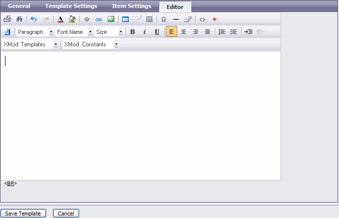
The rich text editor is a word processor-like user interface that is integrated with a toolbar for inserting XMod tags.
How Do I Insert XMod Tags? How Do I Insert
My Form's Data?
Let's quickly walk through the process
of creating an XMod tag, using the tag you'll probably be using the most
as you work on positioning your form's data in your template: the <xmod:field>
tag
- Make sure you've
selected your form on the General
tab. This isn't required but it saves you some typing.
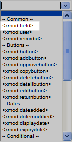
- Select <xmod:field>
from the Template Tag drop down list box and click the Add button.
- A tag designer will
then pop-up for the selected tag. If no designer pops-up, ensure that you haven't blocked pop-ups for the site. The designer will be different based on which
tag you select. Here's the tag designer for the <xmod:field> tag.
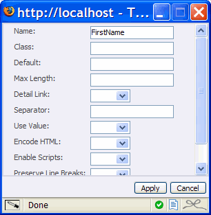
All tag designers are formatted similarly. In the left column is the
property's name and the right column is where you specify the property's
value. Some properties have pre-set values. Others allow you to type in
the value. In the case of <xmod:field> if you've selected an associated
form (on the General Tab), you'll see a list of all the controls (also
called fields) from the form. For details about what each property does,
look up that tag in this help file.
- When you click the
"Apply" button, your changes will be inserted into the editor.
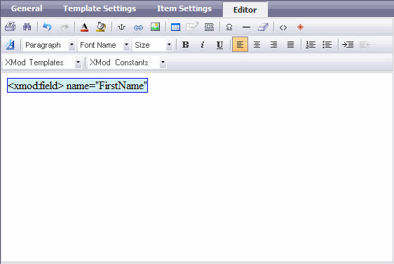
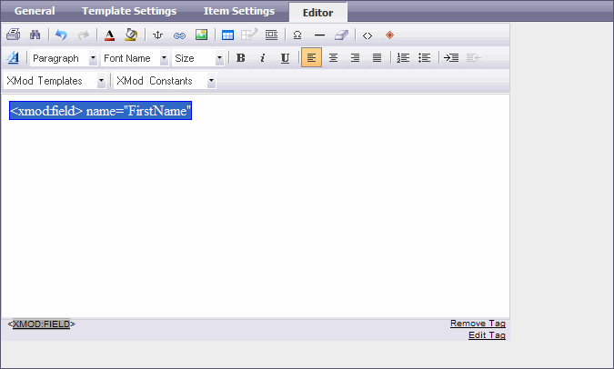
- Editing or Removing a Tag: First click inside the tag with your mouse to select it. Below the editor, you'll see the tag name in a gray bar. Click that tag name and you'll see options to Remove the Tag and Edit the Tag. Click the appropriate link for your needs.
Plain Text Editor
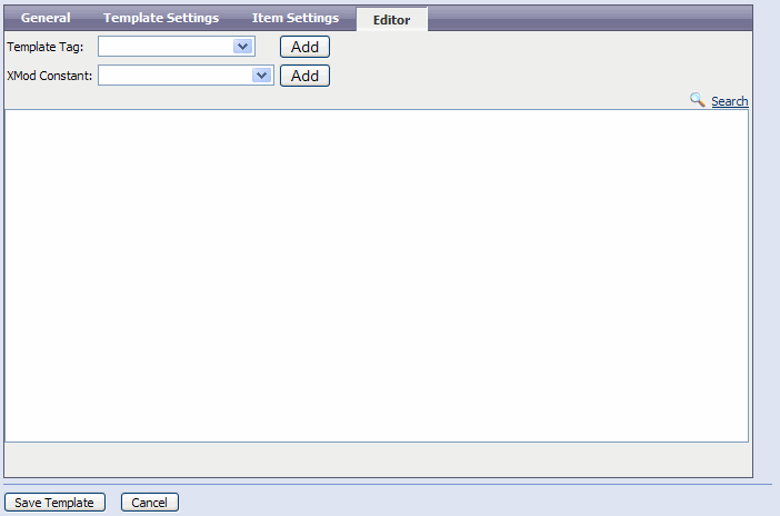
Beginning in XMod 4, we've devoted
a lot of time and effort into enhancing the editor to make it easier for
new users while also preserving the ability of existing users to craft
more advanced solutions. XMod tags are generated by selecting them from
the "Template Tag" drop down list box and clicking the Add button.
XMod 4 also allows you to insert "XMod Constants" into your
display templates. These are placeholders that are replaced at run-time
by various bits of environmental data. Some examples include: the current
time, the current user's ID, the portal's ID, the current user's IP address,
and much more. Insert XMod Constants by selecting them from the"XMod Constant"
drop down list box and clicking the Add button.
Finally, off to the right, just above the editing area, you'll see a Search link. Click that to bring up the Search tool. This tool allows you to quickly find words or phrases within your template, making it much easier to work with longer templates. This tool is new to XMod 5.0.
How Do I Insert XMod Tags? How Do I Insert
My Form's Data?
Let's quickly walk through the process
of creating an XMod tag, using the tag you'll probably be using the most
as you work on positioning your form's data in your template: the <xmod:field>
tag
- Make sure you've
selected your form on the General
tab. This isn't required but it saves you some typing.
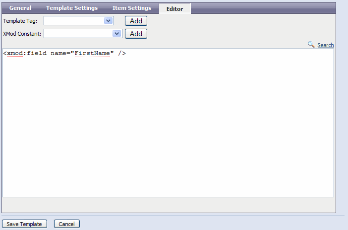
- Select <xmod:field>
from the Template Tag drop down list box and click the Add button.
- A tag designer will
then pop-up for the selected tag. If no designer pops-up, ensure that you haven't blocked pop-ups for the site. The designer will be different based on which
tag you select. Here's the tag designer for the <xmod:field> tag.
All tag designers are formatted similarly. In the left column is the
property's name and the right column is where you specify the property's
value. Some properties have pre-set values. Others allow you to type in
the value. In the case of <xmod:field> if you've selected an associated
form (on the General Tab), you'll see a list of all the controls (also
called fields) from the form. For details about what each property does,
look up that tag in this help file.
- When you click the
"Apply" button, your changes will be inserted into the editor.
Once you've finished creating or editing
your template, click the "Save Template" button to save your
changes. If you want to start over, click the "Cancel" button.
Back to Top