Custom Form Editor v5.0
When you need full control over a form's HTML layout and behavior, the Custom Form Editor is where you work. It's a professional-grade code editor built into the Control Panel, designed specifically for writing XMod Pro forms by hand.
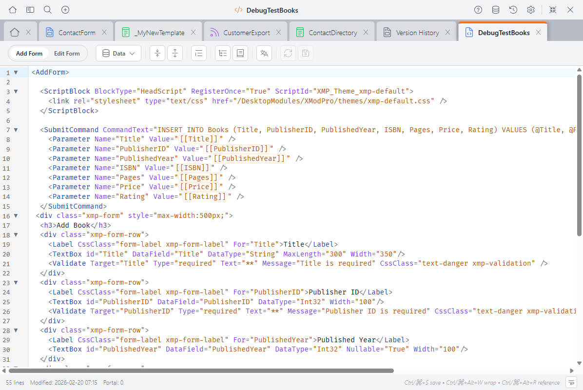
Custom forms give you complete control over your form's HTML structure, styling, and behavior. You write <AddForm> and <EditForm> blocks containing XMP form controls like <TextBox>, <DropDownList>, and <Validate> tags — all mixed freely with your own HTML and CSS.
Custom Forms vs. Form Builder
The Form Builder is a visual, drag-and-drop editor for building forms quickly. The Custom Form Editor is for when you need more control — custom HTML layout, advanced JavaScript, or tag configurations the Form Builder doesn't support. You can also convert a Form Builder form to a custom form and continue editing it here.
What You Write Here
A custom form contains one or both of these blocks:
<AddForm>— The form displayed when creating a new record<EditForm>— The form displayed when editing an existing record
Inside these blocks, you use XMP form controls — tags like <TextBox>, <DropDownList>, <CheckBox>, <FileUpload>, and many more. Unlike view tags, form controls do not use the xmod: prefix.
<AddForm>
  <Label For="txtName" Text="Name" />
  <TextBox Id="txtName" DataField="FullName" DataType="string" />
  <Validate Type="required" Target="txtName" Text="Name is required." />

  <Label For="ddlCategory" Text="Category" />
  <DropDownList Id="ddlCategory" DataField="Category" DataType="string">
    <ListItem Value="">-- Select --</ListItem>
    <ListItem Value="Bug">Bug Report</ListItem>
    <ListItem Value="Feature">Feature Request</ListItem>
  </DropDownList>

  <AddButton Text="Submit" />

  <SubmitCommand CommandText="INSERT INTO Tickets (FullName, Category)
    VALUES (@FullName, @Category)" />
</AddForm>The Toolbar
The toolbar runs along the top of the editor:
- Fold All / Unfold All — Collapse or expand all foldable sections
- Format Code — Clean up indentation (selected code, or all code if nothing is selected)
- Structure Navigator — Toggle a sidebar showing
<AddForm>,<EditForm>, and any regions you've defined (details below) - Reference Panel — Toggle a sidebar with form controls, tokens, and snippets (details below)
- Localization — Edit localization strings for this form
- Validation — Shows the count of errors and warnings (details below)
- Reload — Discard unsaved changes and reload from the server
- Save — Save your changes (Ctrl+S / Cmd+S)
The status bar at the bottom shows the line count, last modified date, keyboard shortcuts, and a word wrap toggle.
Autocomplete
The editor understands the form context and offers suggestions as you type:
- Form controls —
<TextBox>,<DropDownList>,<CheckBox>,<FileUpload>,<Label>, and all other form controls - Validation tags —
<Validate>with its Type, Target, and other attributes - Action controls —
<AddButton>,<UpdateButton>,<CancelButton>, and their image/link variants - Data commands —
<SubmitCommand>,<SelectCommand>,<ControlDataSource>, and related tags - Tag attributes — Context-aware suggestions for the current tag's attributes
- Attribute values — Known values for attributes like
DataType,Orientation, etc. - Tokens —
[[FieldName]],[[User:...]],[[Portal:...]], and other token types - Database columns — Column names from your form's data source
- HTML elements — Standard HTML tags
- Snippets — Your saved code snippets, ready to insert
Autocomplete appears automatically as you type, or press Ctrl+Space to trigger it manually.
Validation
The editor validates your form structure in real time, catching problems before you save:
- Errors appear with red indicators in the gutter and wavy red underlines
- Warnings appear with orange indicators and orange underlines
- Info messages appear with blue indicators
The validation badge in the toolbar shows a count of current errors and warnings. Click it to open the validation panel, which lists all issues with line numbers — click any issue to jump to that line.
What Gets Validated
The editor runs two levels of checks. Structural checks run automatically as you type:
- A
<ControlDataSource>reference that doesn't match any defined<ControlDataSource Id="...">element - Controls with
DataFieldattributes but no<SelectCommand>to load data <Validate>targets that don't match any controlId- Controls with
DataFieldbut no data source elements at all - Data source elements (
<SelectCommand>,<SubmitCommand>, etc.) with empty or missingCommandText
Database checks run when you click the validation button and verify your SQL against the actual database:
- Tables or stored procedures referenced in your SQL that don't exist
DataFieldvalues that don't match columns in the<SelectCommand>tableDataTextFieldorDataValueFieldon list controls that don't match columns in their<ControlDataSource>
Validation is advisory — it highlights issues but never blocks saving.
Shared Editor Features
The Custom Form Editor shares these features with the View Editor and Feed Editor:
Syntax Highlighting
- XMP tokens like
[[FieldName]]and[[User:ID]]are highlighted in orange - XMP tags are syntax-colored (each editor highlights the tags relevant to its context)
- Comments using
[-- ... --]syntax are dimmed - HTML tags, attributes, and strings each get their own colors
- Regions (
#region/#endregion) are visually marked
The editor supports light and dark themes — switch between them in Settings.
Code Folding
Collapse sections to focus on what you're working on. Click the fold indicator in the gutter, or use Fold All / Unfold All in the toolbar.
Foldable sections include <AddForm> / <EditForm> blocks, #region / #endregion blocks, and any multi-line XML/HTML tags.
Using Regions
Wrap sections in #region Section Name and #endregion to create named, collapsible sections — great for organizing long forms:
#region Validation Rules
  <Validate Type="required" Target="txtName" Text="Name is required." />
  <Validate Type="email" Target="txtEmail" Text="Please enter a valid email." />
#endregionStructure Navigator
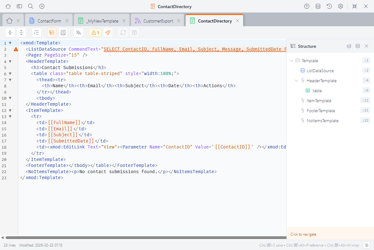
Click Structure Navigator in the toolbar to see an outline of your form: <AddForm>, <EditForm>, and any regions. Click an item to jump directly to it.
Reference Panel
Click Reference Panel (or press Ctrl+Alt+R / Cmd+Alt+R) to open a searchable sidebar with:
- Form controls & attributes — Every available form control and its properties
- Tokens — All token types and their syntax
- Snippets — Your saved snippets, ready to insert with a click
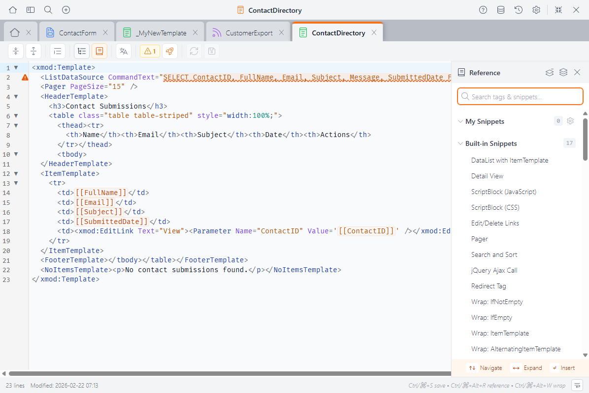
The panel automatically shows form-context content when you're editing a form.
Keyboard Shortcuts
| Shortcut | Action |
|---|---|
| Ctrl+S / Cmd+S | Save |
| Ctrl+Z / Cmd+Z | Undo |
| Ctrl+Shift+Z / Cmd+Shift+Z | Redo |
| Ctrl+F / Cmd+F | Find |
| Ctrl+Space | Trigger autocomplete |
| Ctrl+Alt+W / Cmd+Alt+W | Wrap selection with a tag |
| Ctrl+Alt+R / Cmd+Alt+R | Toggle Reference Panel |
| Tab / Shift+Tab | Indent / outdent selected lines |
Next Steps
- Form Controls Reference — Detailed docs for every form control
- Form Builder — Build forms visually when you don't need full code control
- Snippets — Create reusable code snippets
- Version History — Browse, compare, and restore previous versions