I'm glad to see you've stuck with me to this final lesson. In previous lessons we learned to create a form using the Form Builder, configure our module to use the form, add validation, and now we're going to add a little color and styling to give our form a more polished look
- As with the other lessons, we need to start by editing our form. From the Control Panel, select Manage Forms. In the Form Manager Grid, find the "ContactUs" form and click the pencil next to its name. This will bring up the Form Builder, ready to edit your form. Once you're there, click the Styling

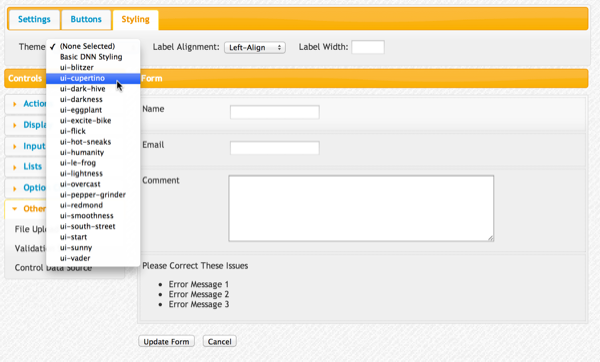
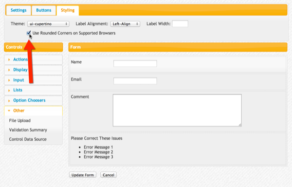
- This takes you to the styling tab where you can select a Theme, whether to use rounded corners on supported browsers, label alignment and label width. Start by selecting "ui-cupertino" from the theme list. This is a consevative blue theme that works well for many businesses. Incidentally, this theme, and the others come from jQuery UI's theme library. You can even roll-your-own themes using their free Themeroller tool, though that is beyond the focus of this tutorial. Since XMod Pro's forms are structured to take advantage of jQuery UI themes, you have an unlimited number of looks you can craft - one that will be just perfect for the site you're building.
Note that once you select a theme, you won't see it reflected in the form canvas. You will be able to see it in the Form Preview (which will do shortly).

- Next, since we like that web 2.0 look of rounded corners. Let's tick that box. Rounded corners are available on most modern web browsers. Those that don't support it (*cough* IE) will simply display regular corners so your older visitors won't have broken pages.

- We could also change the labels so they are right-aligned, or even on top of their controls. We could also change the label width (handy for keeping labels from wrapping their text or for trimming excess negative space in your form), but I'll leave that as your exercise. Unlike themes, if you change the label width or alignment, you'll see that reflected live in the form canvas. This allows you to pixel push, getting just the right size.
- Now that we've set our style, let's save the form by clicking the "Update Form" button at the bottom of the form canvas.
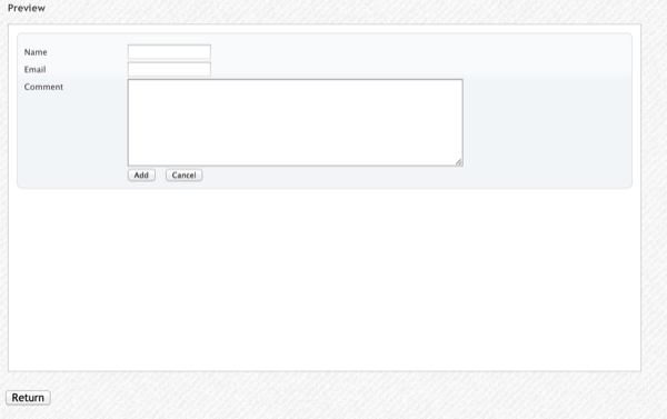
- Now Preview the form by clicking the magnifying glass icon next to the ContactUs form name in the Form Manager Grid. You should see something like this. Notice the text has changed (probably) and there is a light blue gradient background to the form.

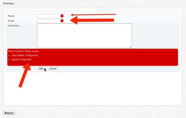
- Finally, click the Add button to test your validation and you'll see some more of the theme at work:

That's it! We've created a form with the form builder, configured our module to use it, added validation, added the ability to send email notifications, learned how to preview a form, and added a little styling pizazz - all without a single line of code. Pretty cool, eh? There is a LOT more that XMod Pro can do. I invite you to keep exploring, asking and answering questions in the community, and read through more of the guide. Pretty soon, you'll become an XMod Pro yourself :)